Day 02: Landing page
Today was all about finishing the shikadigital.co.jp landing page—and more importantly, finding the right aesthetic voice through iteration.
The Design Evolution
We started with a complete landing page structure: hero, value proposition, trust signals, million-dollar treatment section, and closing CTA. Everything was there functionally, but something felt off. The design had too much decoration, too many competing elements, and not enough confidence.
First Pass: Overdesigned
The initial implementation had all the trappings of “modern” web design:
- Decorative grid patterns and background overlays
- Animated arrow effects on buttons
- Complex multi-element card structures
- Side-by-side comparison layouts
- Nested containers with subtle gradients
It looked fine. But fine isn’t memorable.
The Simplification Journey
We went through several rounds of refinement, each time stripping away complexity:
Round 1: Streamline the design system
- Reduced design rules from 382 to 133 lines
- Consolidated typography hierarchy
- Clarified color palette usage
- Focused on core anti-AI-slop principles
Round 2: Simplify visual complexity
- Removed decorative grid patterns
- Stripped out background overlays
- Simplified button styling (no more animated overlays)
- Removed animated arrows and text separations
- Refactored comparison cards into typography-driven layouts
Round 3: Restructure for impact
- Transformed ClosingCTA to dark theme for contrast
- Restructured ValueProposition layout
- Enhanced hero animations while simplifying trust signals
- Added Statement section with refined spacing
Round 4: Color consistency
- Refined accent styling across CTA sections
- Fixed button colors (darker teal shade)
- Ensured color consistency throughout
What We Learned
The best design isn’t about adding more—it’s about having the confidence to do less. Each iteration removed elements that were there “just because” and kept only what served the message.
The final landing page is bold, direct, and unapologetically simple. Large typography, strong contrast, clear hierarchy. No decoration for decoration’s sake.
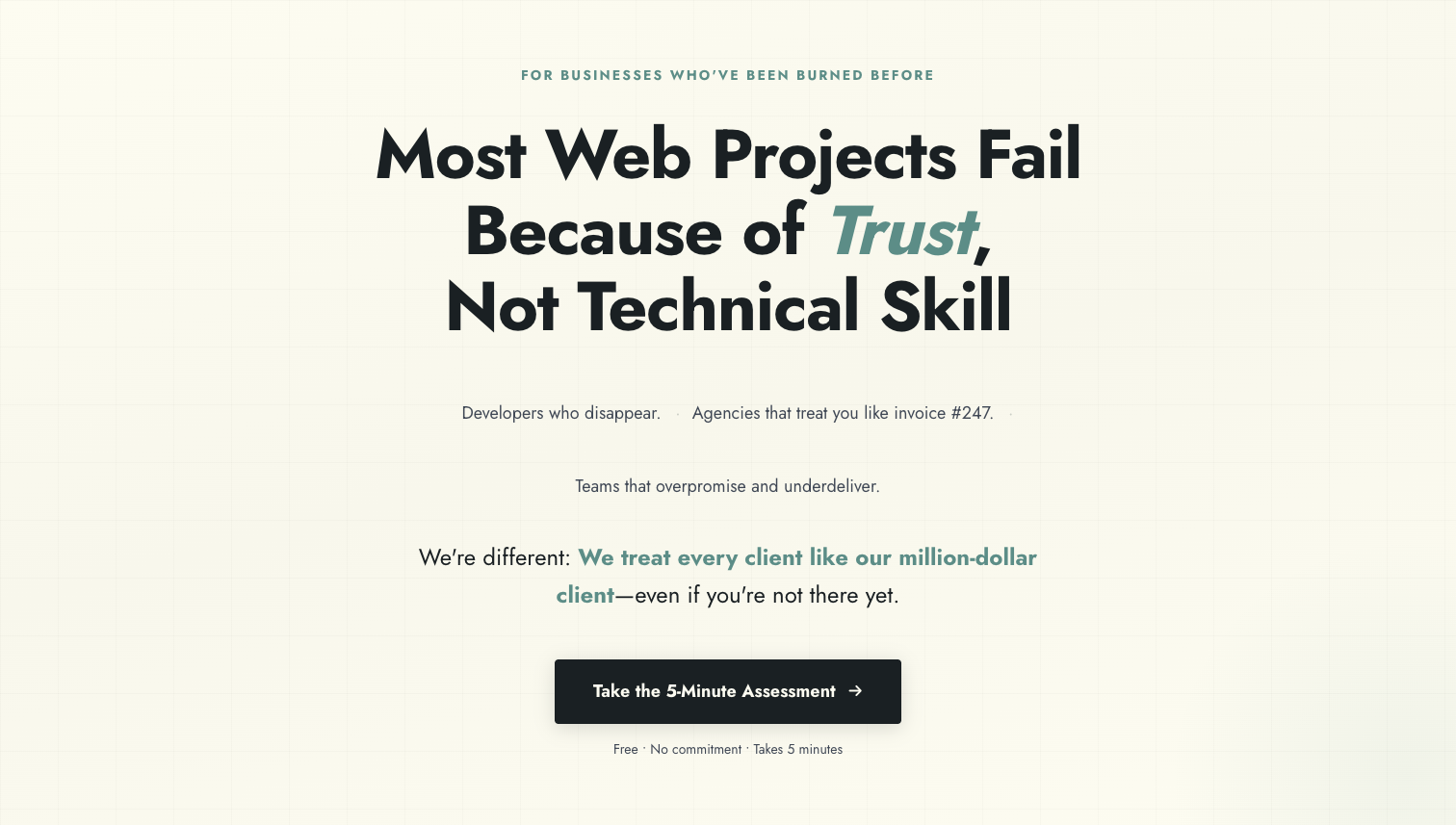
Before and After
Here’s the visual transformation from the initial design to the final simplified version:
Before: The initial design with lighter colors and more traditional layout
After: The refined design with dark theme, bold typography, and simplified structure
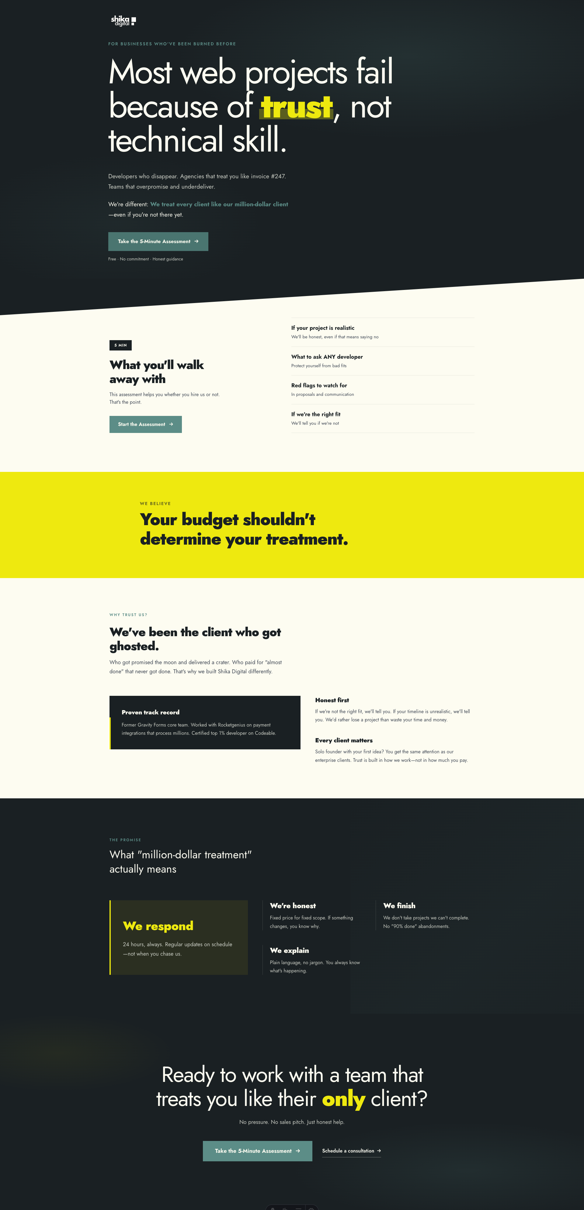
The difference is striking. The “after” version has more confidence, better contrast, and a clearer visual hierarchy. The dark hero section immediately sets a different tone, and the simplified layouts let the message breathe.
Technical Notes
- All components maintain accessibility features (focus-visible states)
- Responsive typography scales properly across breakpoints
- Dark theme implementation on ClosingCTA increases visual impact
- Reduced component complexity from 639 to 223 lines across four major sections
Tomorrow: Moving on to the next feature while this aesthetic foundation is solid.